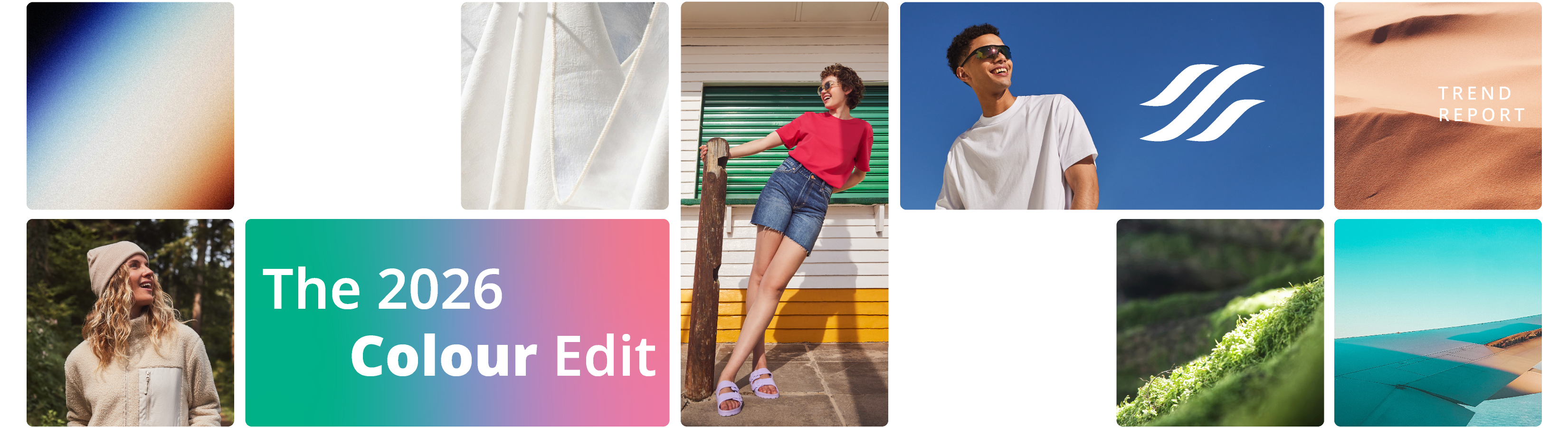
Discover the shades that are shaping the industry
Y O U R C O L O U R E X P E R T S


Colour has always been central to great apparel; it shapes identity, influences mood and plays a huge part in what your customers choose. As we head further into 2026, staying ahead of colour trends isn’t just helpful, it’s essential for spotting opportunities, responding to demand and creating products your customers connect with instantly.
Whether you’re printing, embroidering or sourcing blanks, we’re already seeing certain shades rise across fashion, retail and design. To help you stay ahead of what’s coming through, we’ve done the research for you.
Drawing on insights from WGSN, Coloro and Pantone, we’ve identified the key colour stories influencing the industry this year and how you can find similar shades across our range, even when naming varies between brands. You can find similar shades in these four colour groups in our 2026 Colour Product Guide.
Scott Evans, Head of Product
>Section 1
Win with WGSN + Coloro Colour of the Year 2026
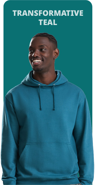
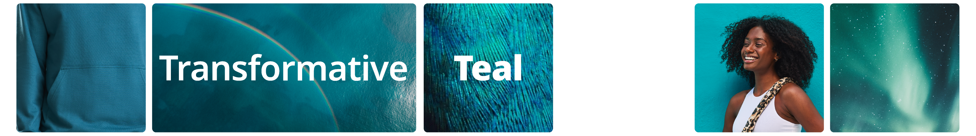
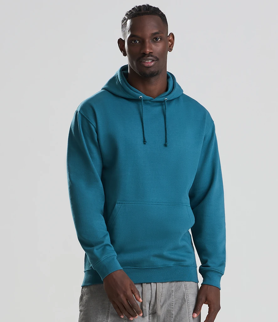
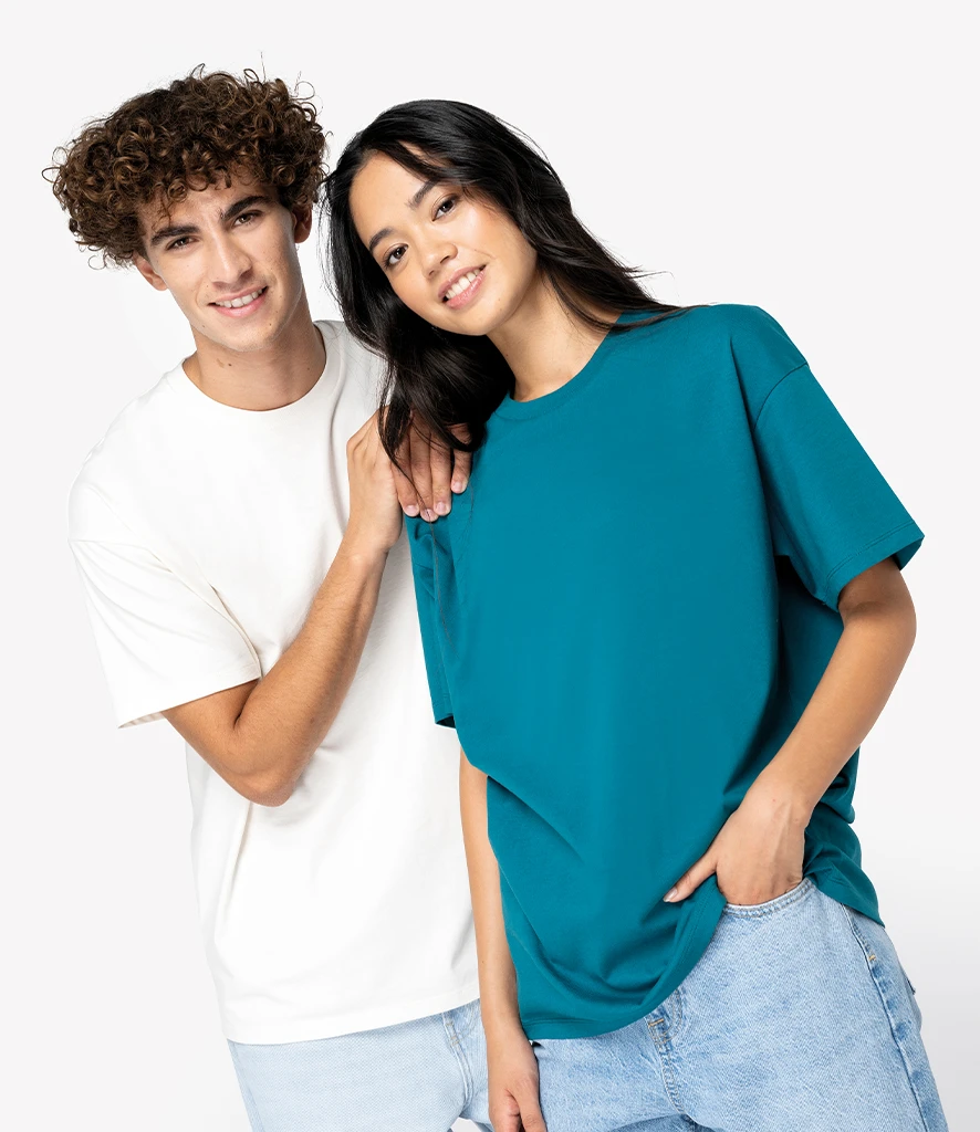
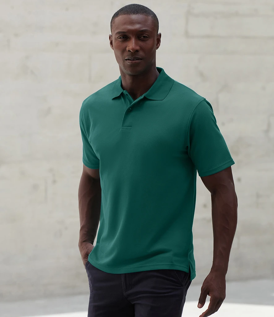
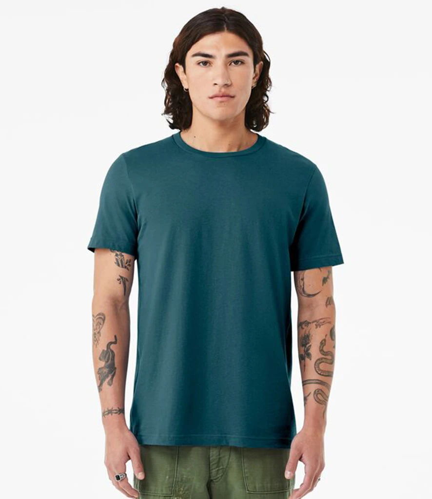
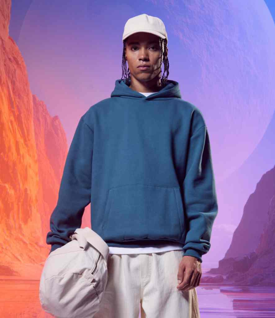
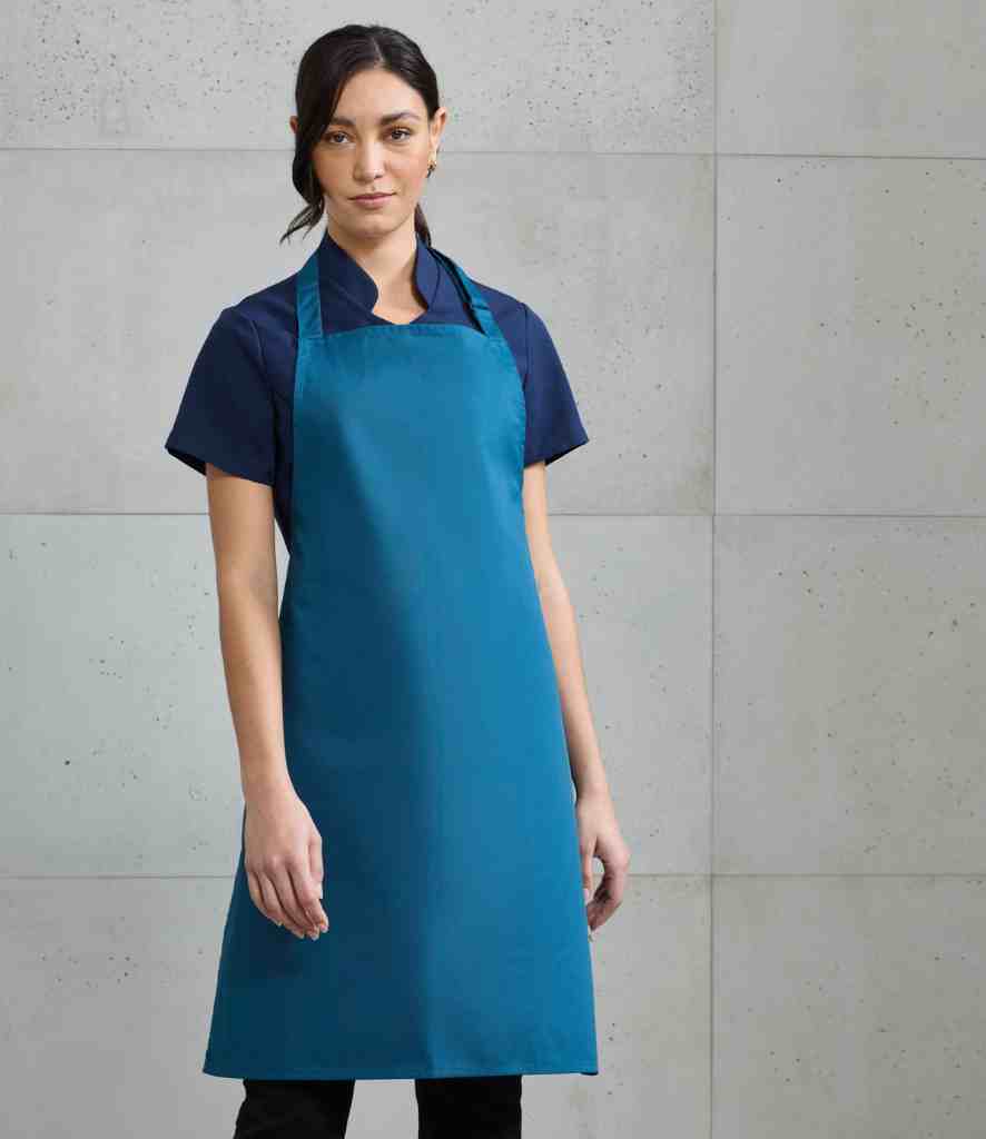
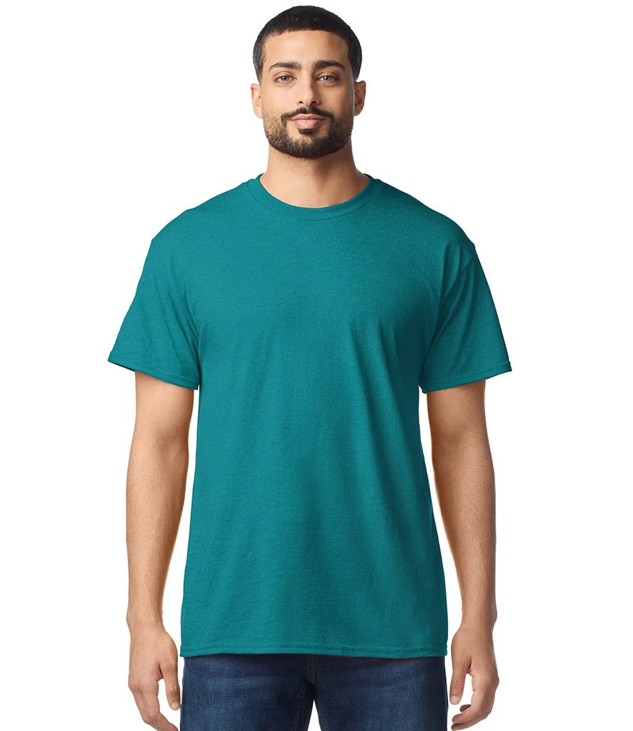
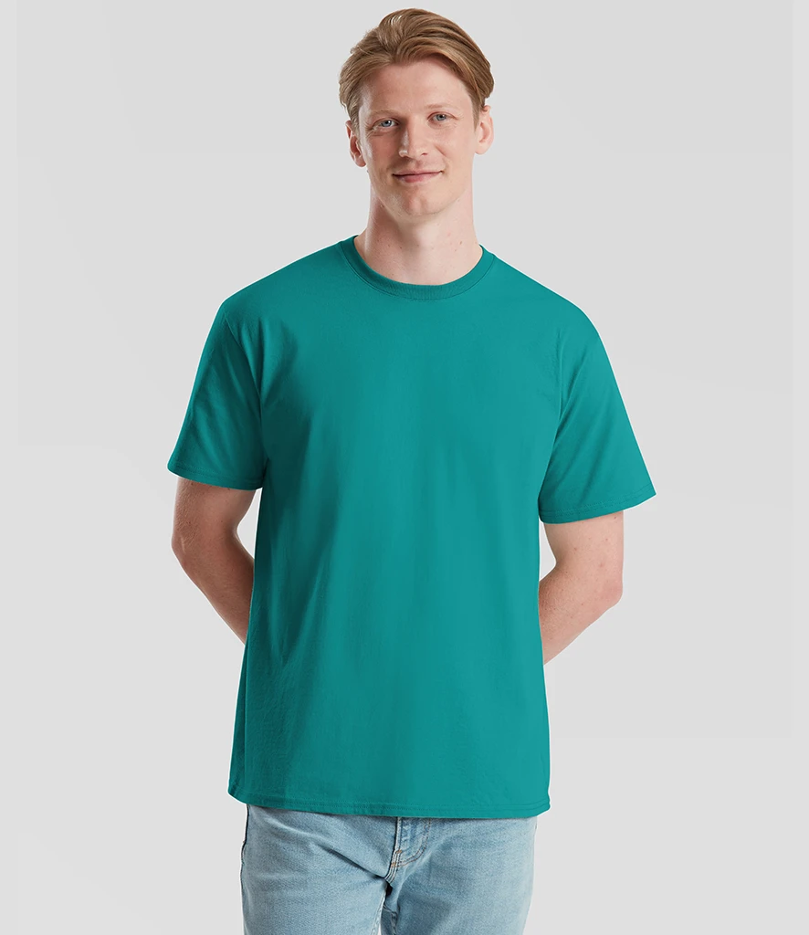
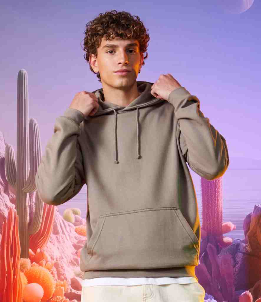
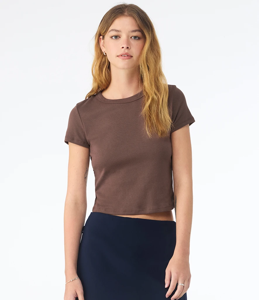
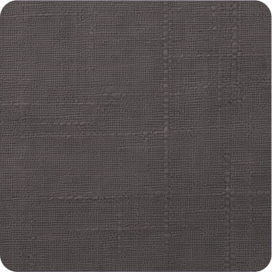
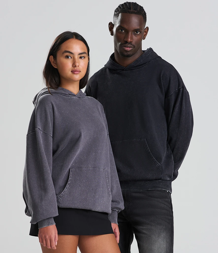
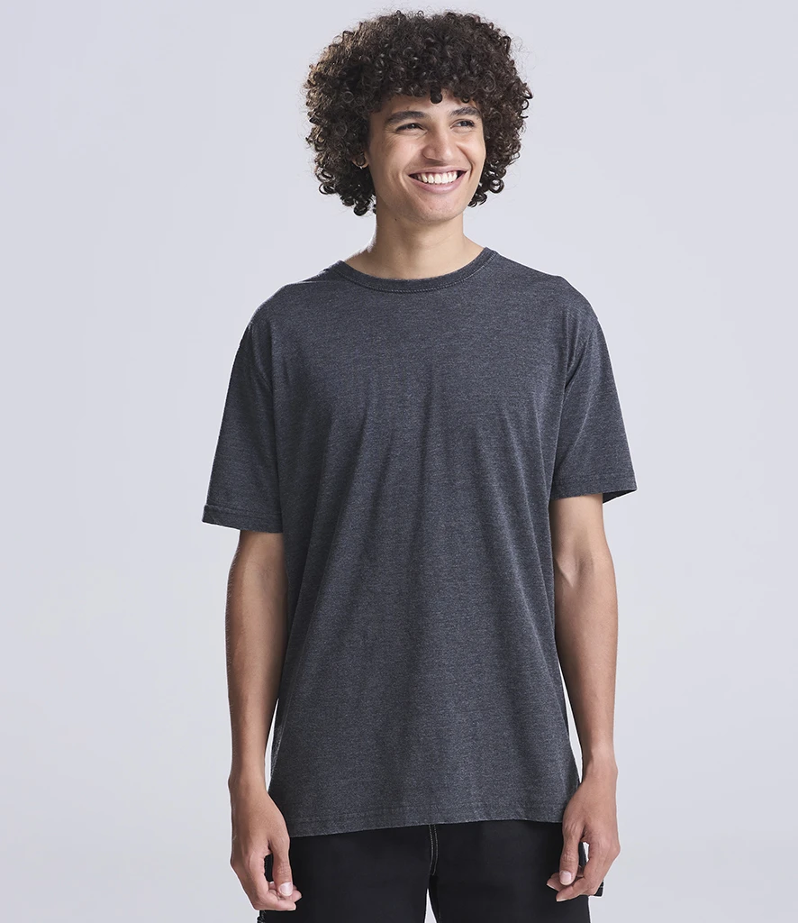
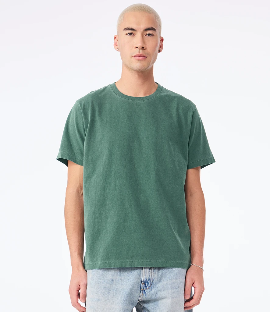
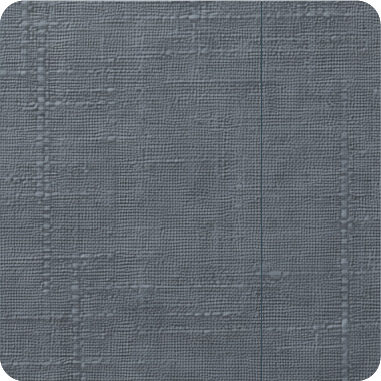
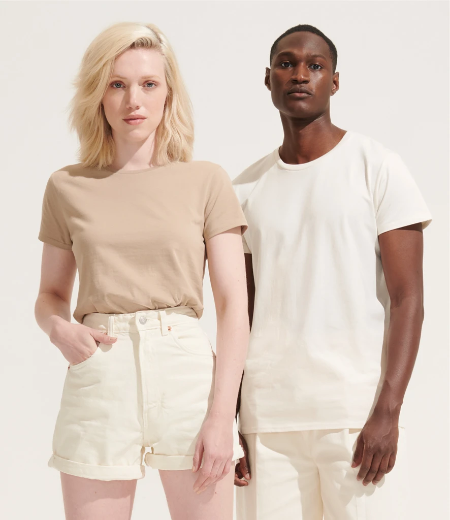
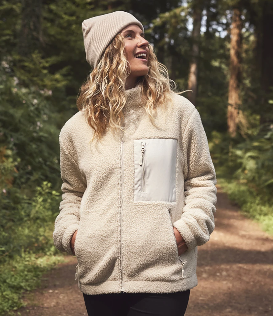
Teal blends the calm of blue with the richness of green to create a shade that feels bold yet balanced. Its depth makes it strong for colder months, while its freshness works well into spring, giving it year‑round appeal. As one of the key colours shaping 2026, it offers an easy way to introduce a bold highlight shade that works across multiple categories without limiting commercial appeal.
Where it’s showing up:
Where it’s showing up:
- Hospitality & Corporatewear: A modern alternative to navy for polos and uniform basics
- Education: Increasingly seen in PE kits, club colours and unisex sportswear
- Lifestyle: Strong across sweats, tees and premium casualwear, particularly heavyweight
- Workwear: Offering a deeper, contemporary option to traditional blues
How to use it:
- Premium on heavyweight fleece and brushed cotton
- Pairs beautifully with tonal embroidery, puff print and subtle screen prints
- Works across unisex silhouettes and seasonless capsules
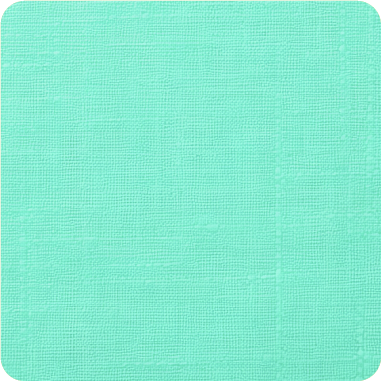
Similar shades: jade, peacock, petrol, lagoon, deep turquoise, ocean blue
Looking for products that fit each colour group?
Download our 2026 Colour Product Guide.
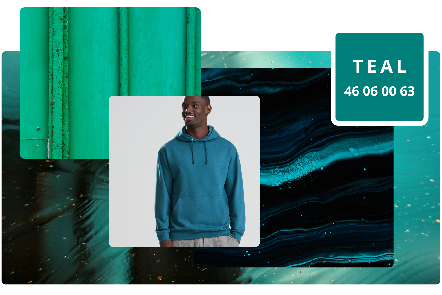
Transformative Teal

Win with WGSN + Coloro Colour of the Year 2026
Teal blends the calm of blue with the richness of green to create a shade that feels bold yet balanced. Its depth makes it strong for colder months, while its freshness works well into spring, giving it year‑round appeal. As one of the key colours shaping 2026, it offers an easy way to introduce a bold highlight shade that works across multiple categories without limiting commercial appeal.
Where it’s showing up:
Where it’s showing up:
- Hospitality & Corporatewear: A modern alternative to navy for polos and uniform basics
- Education: Increasingly seen in PE kits, club colours and unisex sportswear
- Lifestyle: Strong across sweats, tees and premium casualwear, particularly heavyweight
- Workwear: Offering a deeper, contemporary option to traditional blues
How to use it:
- Premium on heavyweight fleece and brushed cotton
- Pairs beautifully with tonal embroidery, puff print and subtle screen prints
- Works across unisex silhouettes and seasonless capsules
Similar shades: jade, peacock, petrol, lagoon, deep turquoise, ocean blue
Looking for products that fit each colour group?
Download our 2026 Colour Product Guide.
Seasonal supporting colours
Seasonal supporting colours


Explore must-have teal styles
; Section 1

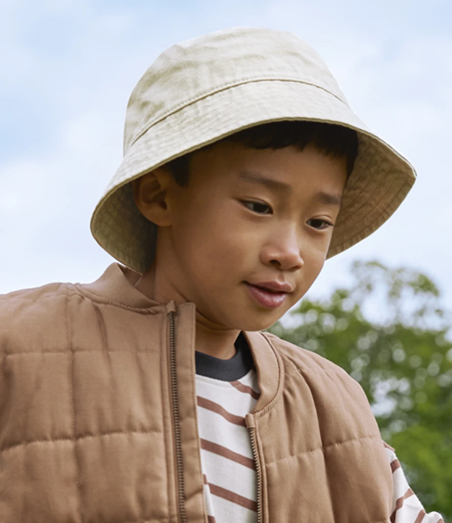
Strengthen your core range with dependable, year‑round shades
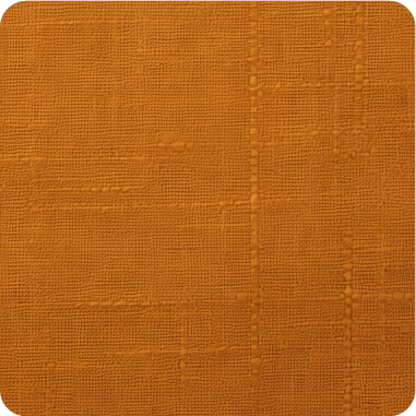
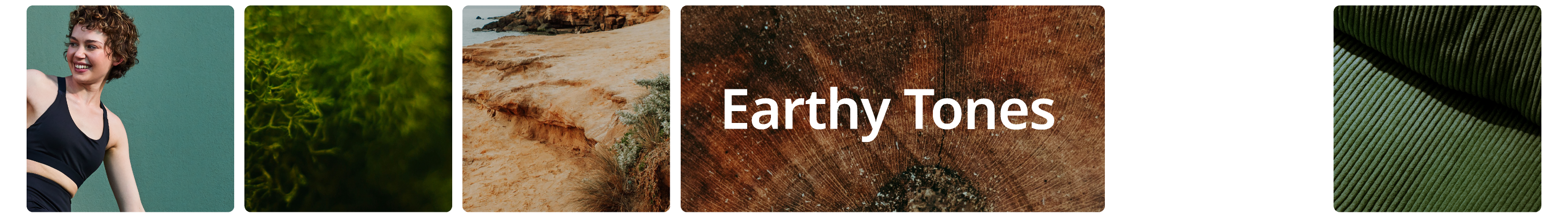
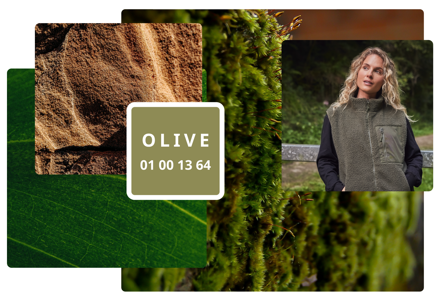
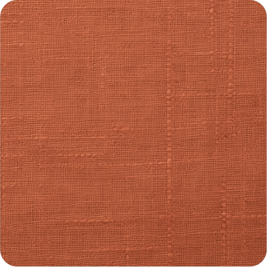
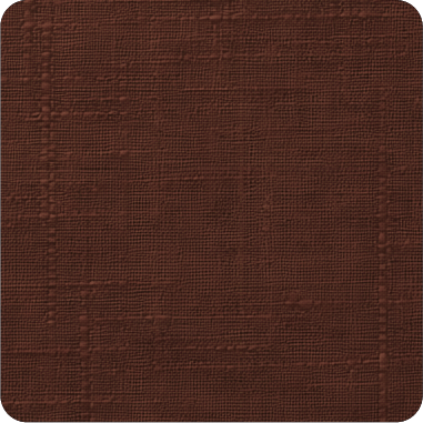
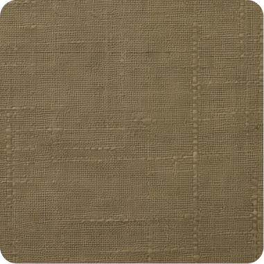
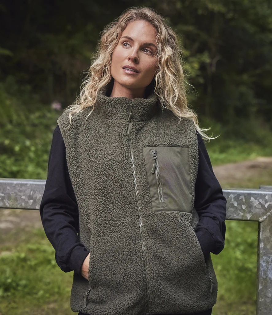
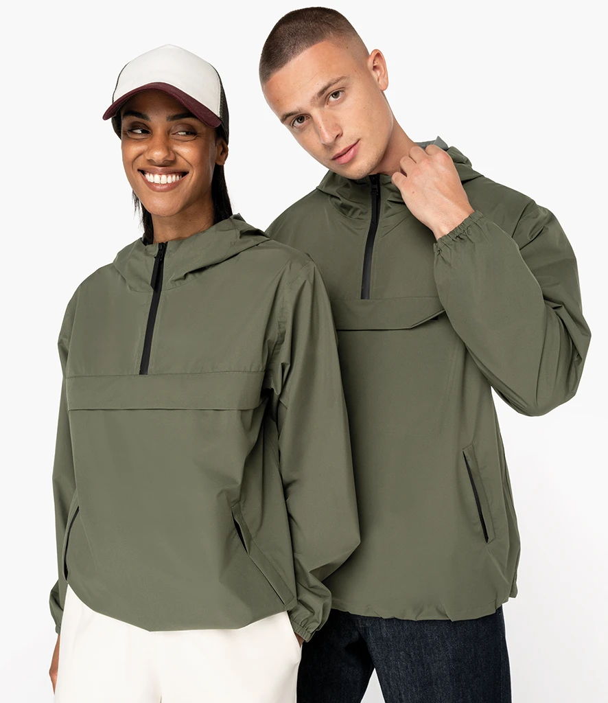
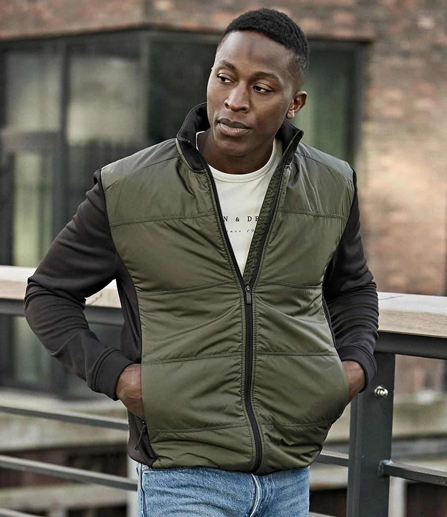
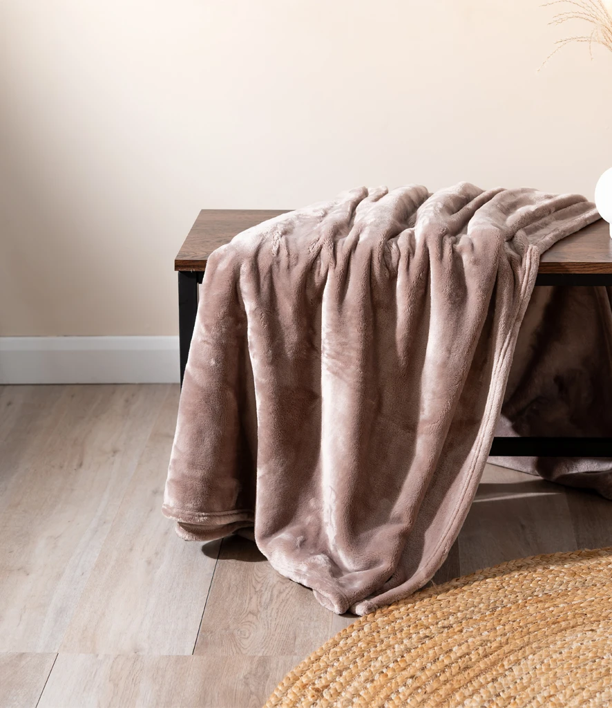
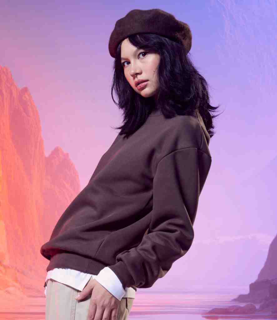
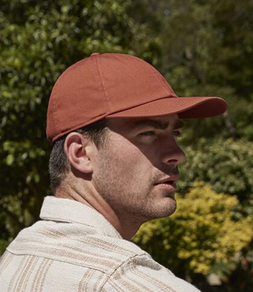
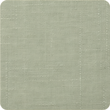
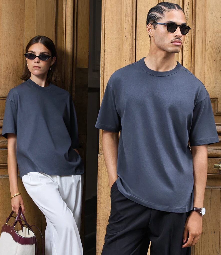
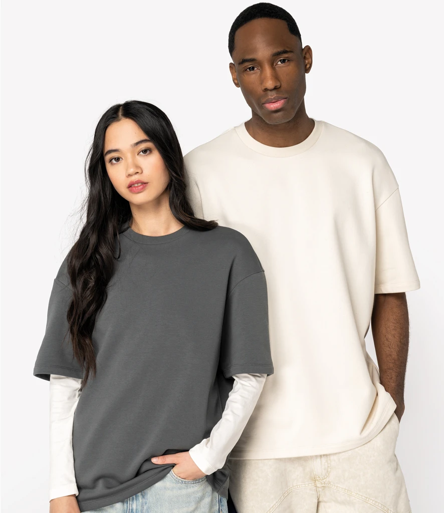
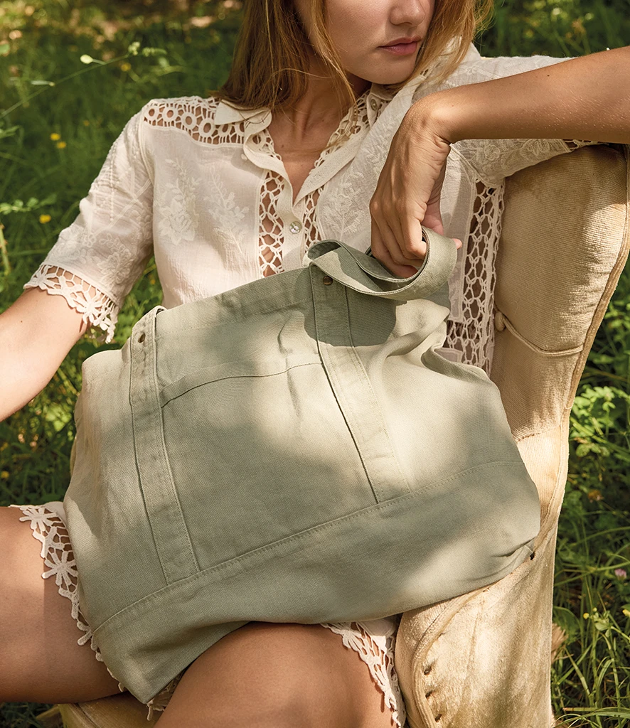
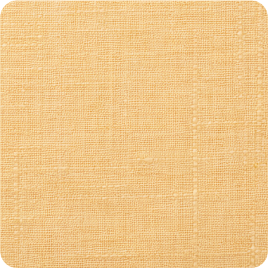
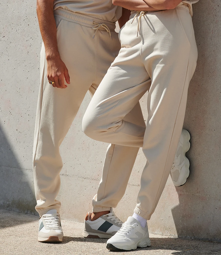
Earthy tones continue to gather momentum, driven by customer demand for calm, natural colours. Shades such as clay, olive and warm neutrals offer reliable versatility across both core and seasonal lines. They’re ideal for elevated basics and lifestyle pieces, particularly for brands focused on everyday wear.
Where these tones are showing up:
- Lifestyle & Retail: Earthy greens, warm neutrals and clay tones appearing across sweats, tees and fleece basics
- Workwear: Natural khakis, deep browns and warm sands provide a durable, utility‑inspired palette, especially in hospitality
- Education: Softer greens and sandy neutrals are used in sports kits and teamwear
- Corporate & Hospitality: Warm neutrals and greens lend a considered, welcoming feel to uniforms
How to use these tones:
- Work beautifully on heavyweight cottons, brushed fleece and textured fabrics
- Pair well with tonal embroidery, matte screen prints and darker ink finishes
- Perfect for unisex silhouettes and capsule colour stories
Similar shades:
khaki, olive, green, clay, terracotta, sand, beige, natural, stone, fawn
Looking for products that fit each colour group?
khaki, olive, green, clay, terracotta, sand, beige, natural, stone, fawn
Looking for products that fit each colour group?
Download our 2026 Colour Product Guide.
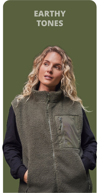
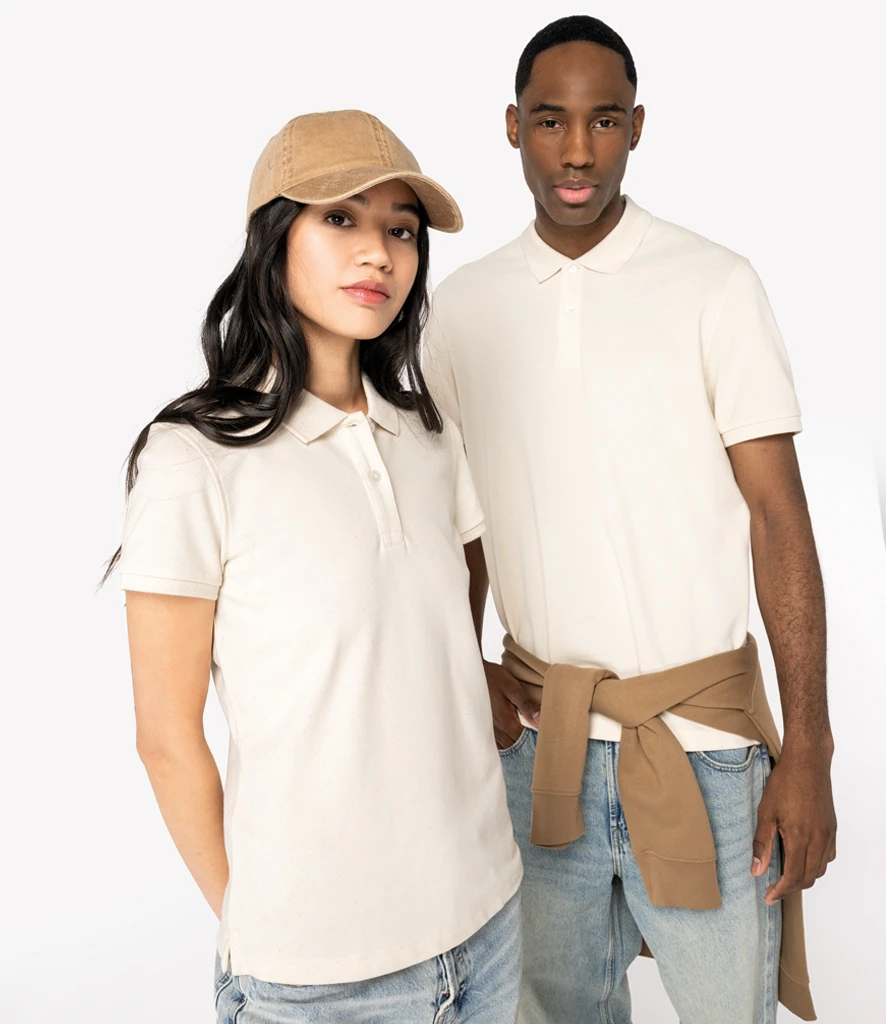
Earthy Tones
Strengthen your core range with dependable, year‑round shades
Earthy tones continue to gather momentum, driven by customer demand for calm, natural colours. Shades such as clay, olive and warm neutrals offer reliable versatility across both core and seasonal lines. They’re ideal for elevated basics and lifestyle pieces, particularly for brands focused on everyday wear.
Where these tones are showing up:
- Lifestyle & Retail: Earthy greens, warm neutrals and clay tones appearing across sweats, tees and fleece basics
- Workwear: Natural khakis, deep browns and warm sands provide a durable, utility‑inspired palette, especially in hospitality
- Education: Softer greens and sandy neutrals are used in sports kits and teamwear
- Corporate & Hospitality: Warm neutrals and greens lend a considered, welcoming feel to uniforms
How to use these tones:
- Work beautifully on heavyweight cottons, brushed fleece and textured fabrics
- Pair well with tonal embroidery, matte screen prints and darker ink finishes
- Perfect for unisex silhouettes and capsule colour stories
Similar shades:
khaki, olive, green, clay, terracotta, sand, beige, natural, stone, fawn
khaki, olive, green, clay, terracotta, sand, beige, natural, stone, fawn
Looking for products that fit each colour group?
Download our 2026 Colour Product Guide.
Earthy tones they'll love


Shop the trending styles
>Section 1
Refresh everyday styles with easy, low‑risk colour
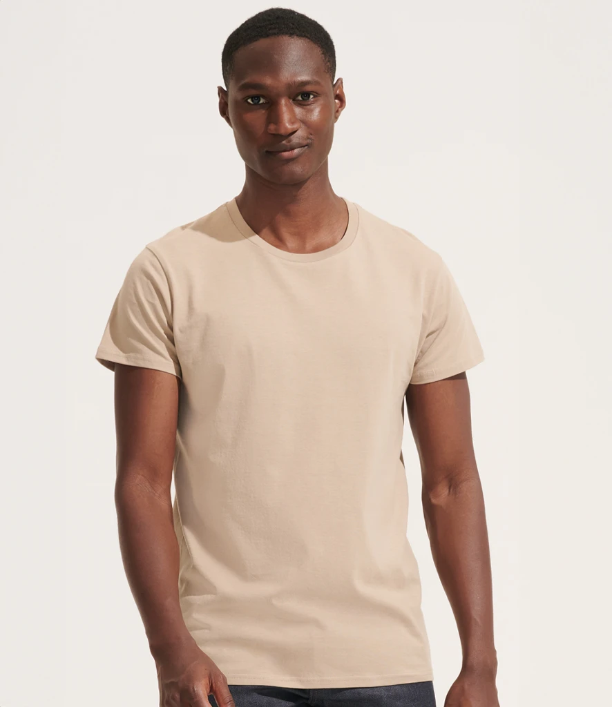
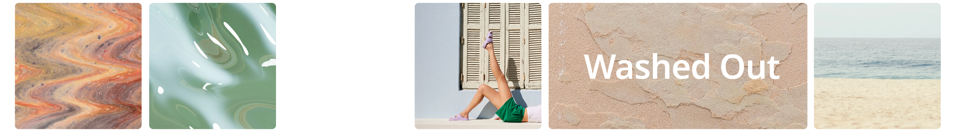
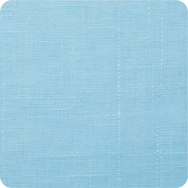
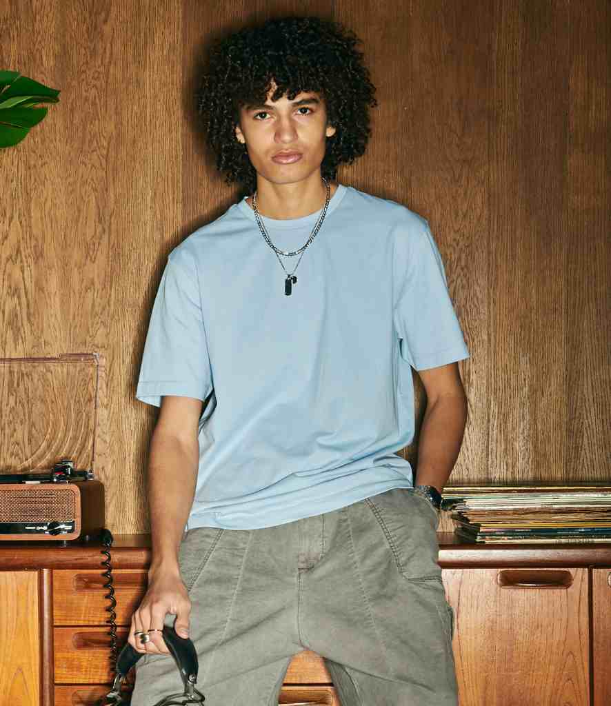
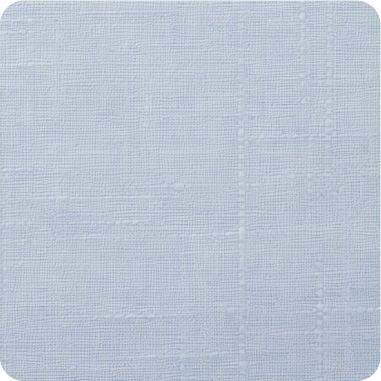
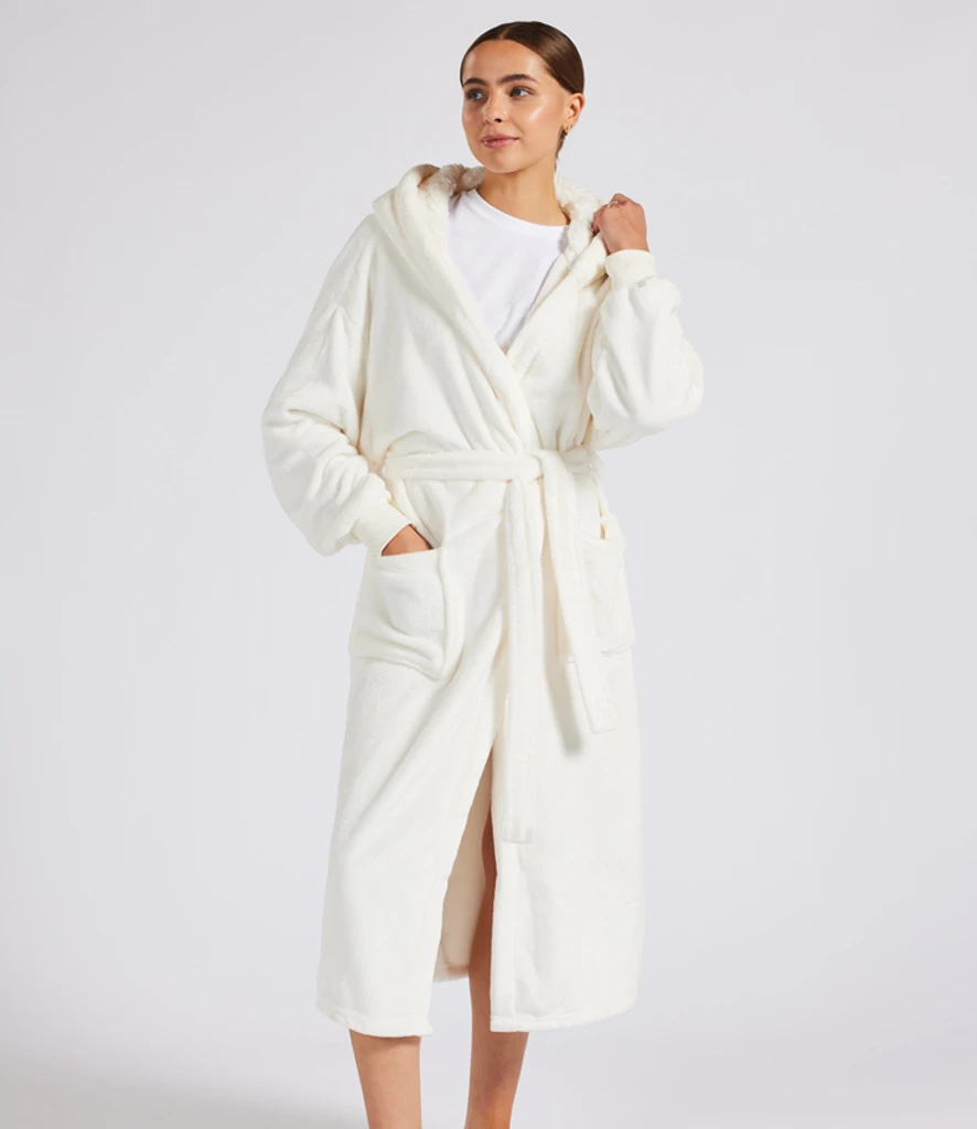
Washed colourways bring a soft, lived‑in look that continues to appeal in 2026. These gentler, toned‑down shades offer an easy way to introduce colour, as they sit comfortably alongside core neutrals and existing basics. Their relaxed, worn‑in feel aligns with ongoing demand for casual, comfort‑first products, making them a dependable option for everyday lines, lifestyle pieces and merch.
Where these tones are showing up:
Where these tones are showing up:
- Merch & Streetwear: Soft, washed sweats and tees dominating relaxed silhouettes
- Leaver’s & Education: Gentle blues, greys and greens offering universal appeal
- Lifestyle: Comfort‑first apparel with a natural, washed finish
- Retail Basics: Elevated essentials in subdued, easy-to-style palettes
How to use these tones:
- Ideal for sweats, tees, lounge silhouettes and everyday basics
- Pair with tonal embroidery, subtle prints and textured decoration
- Create clean, calming, easy‑wear collections
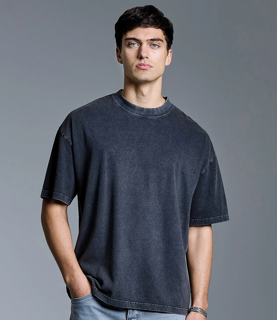
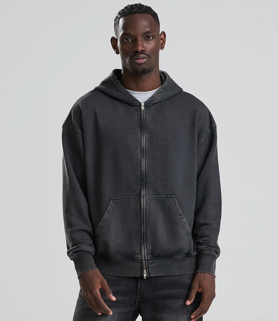
Similar shades: pastel, bleached, muted, faded, distressed, chalky, acid, pale
Looking for products that fit each colour group?
Download our 2026 Colour Product Guide.
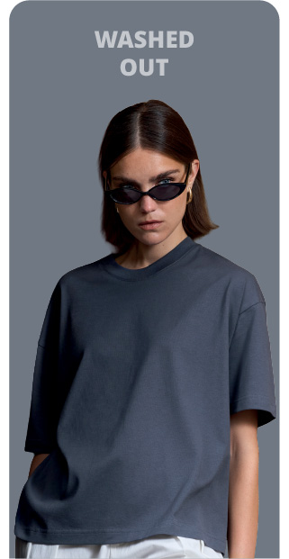
Washed Out

Refresh everyday styles with easy, low‑risk colour
Washed colourways bring a soft, lived‑in look that continues to appeal in 2026. These gentler, toned‑down shades offer an easy way to introduce colour, as they sit comfortably alongside core neutrals and existing basics. Their relaxed, worn‑in feel aligns with ongoing demand for casual, comfort‑first products, making them a dependable option for everyday lines, lifestyle pieces and merch.
Where these tones are showing up:
Where these tones are showing up:
- Merch & Streetwear: Soft, washed sweats and tees dominating relaxed silhouettes
- Leaver’s & Education: Gentle blues, greys and greens offering universal appeal
- Lifestyle: Comfort‑first apparel with a natural, washed finish
- Retail Basics: Elevated essentials in subdued, easy-to-style palettes
How to use these tones:
- Ideal for sweats, tees, lounge silhouettes and everyday basics
- Pair with tonal embroidery, subtle prints and textured decoration
- Create clean, calming, easy‑wear collections
Similar shades: pastel, bleached, muted, faded, distressed, chalky, acid, pale
Looking for products that fit each colour group?
Download our 2026 Colour Product Guide.
Washed colours to watch
Discover on-trend Washed Out styles
>Section 1
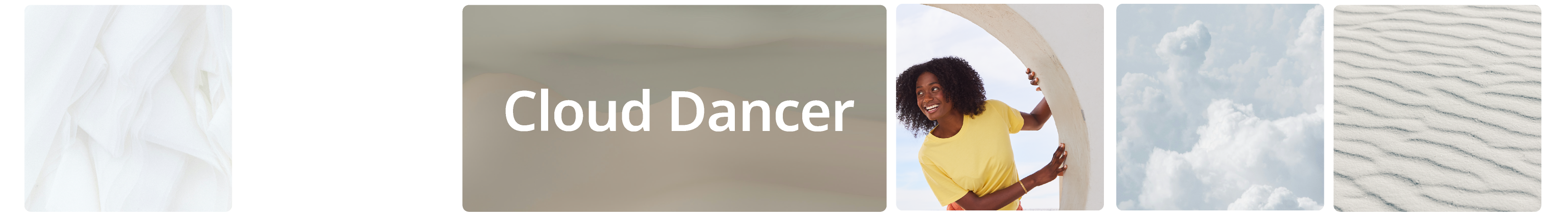
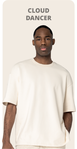
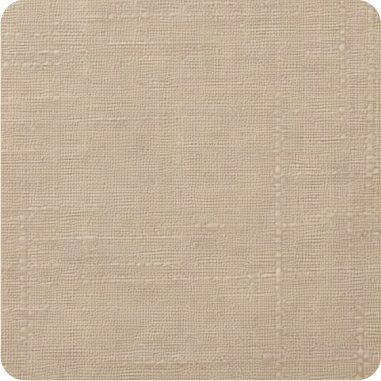
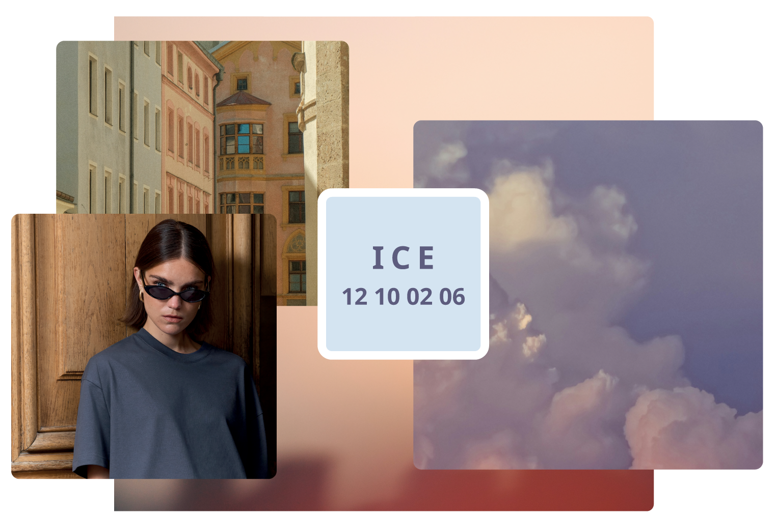
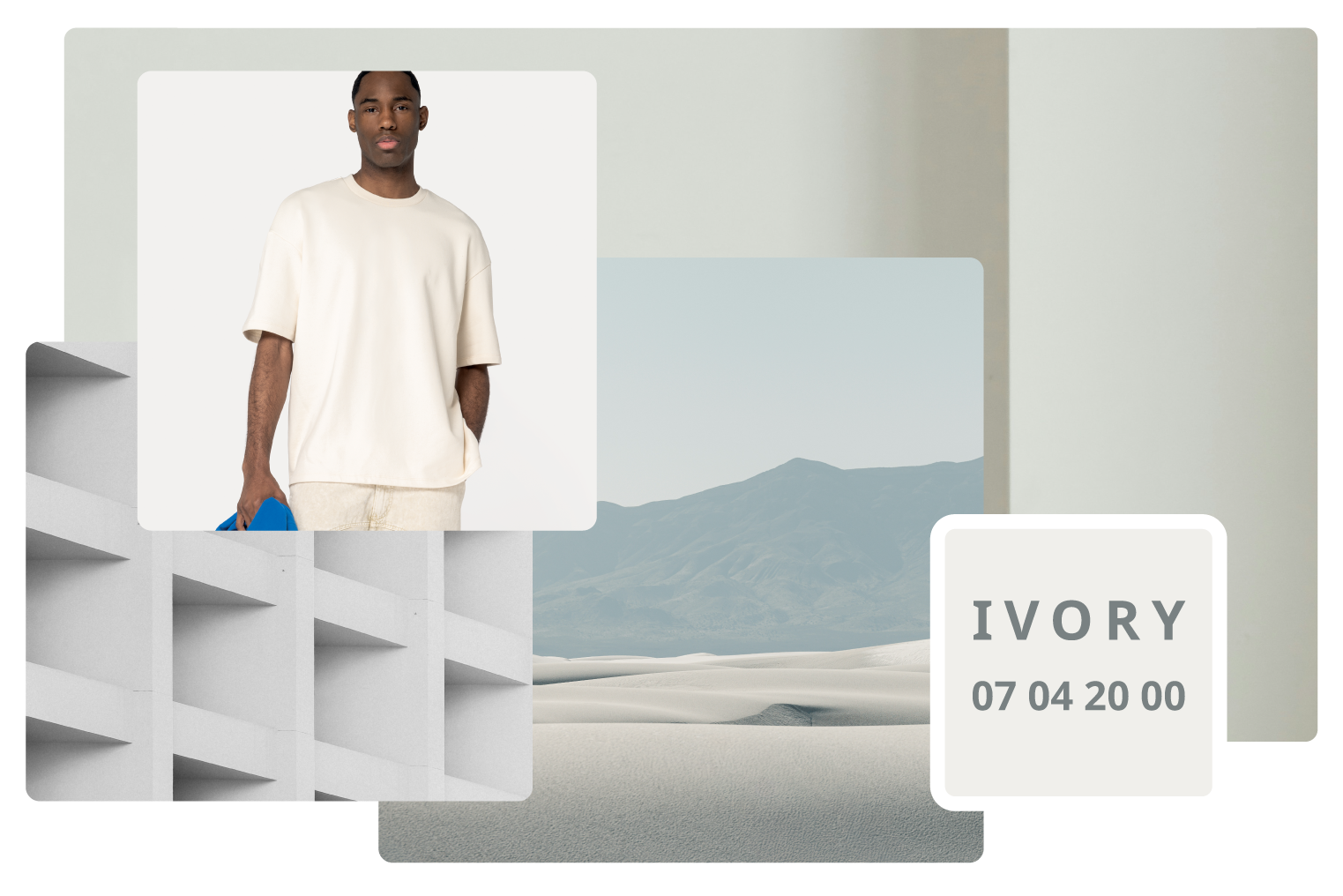
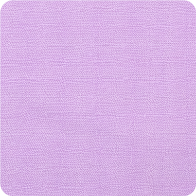
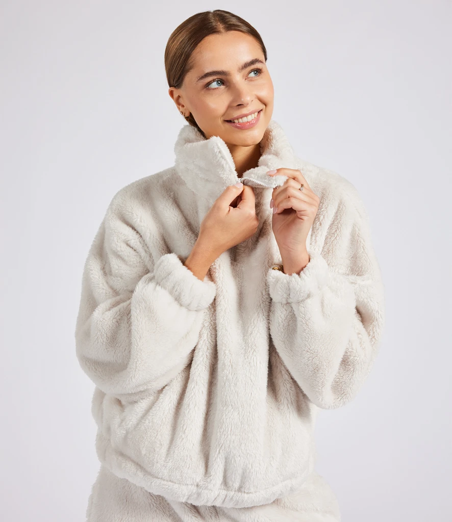
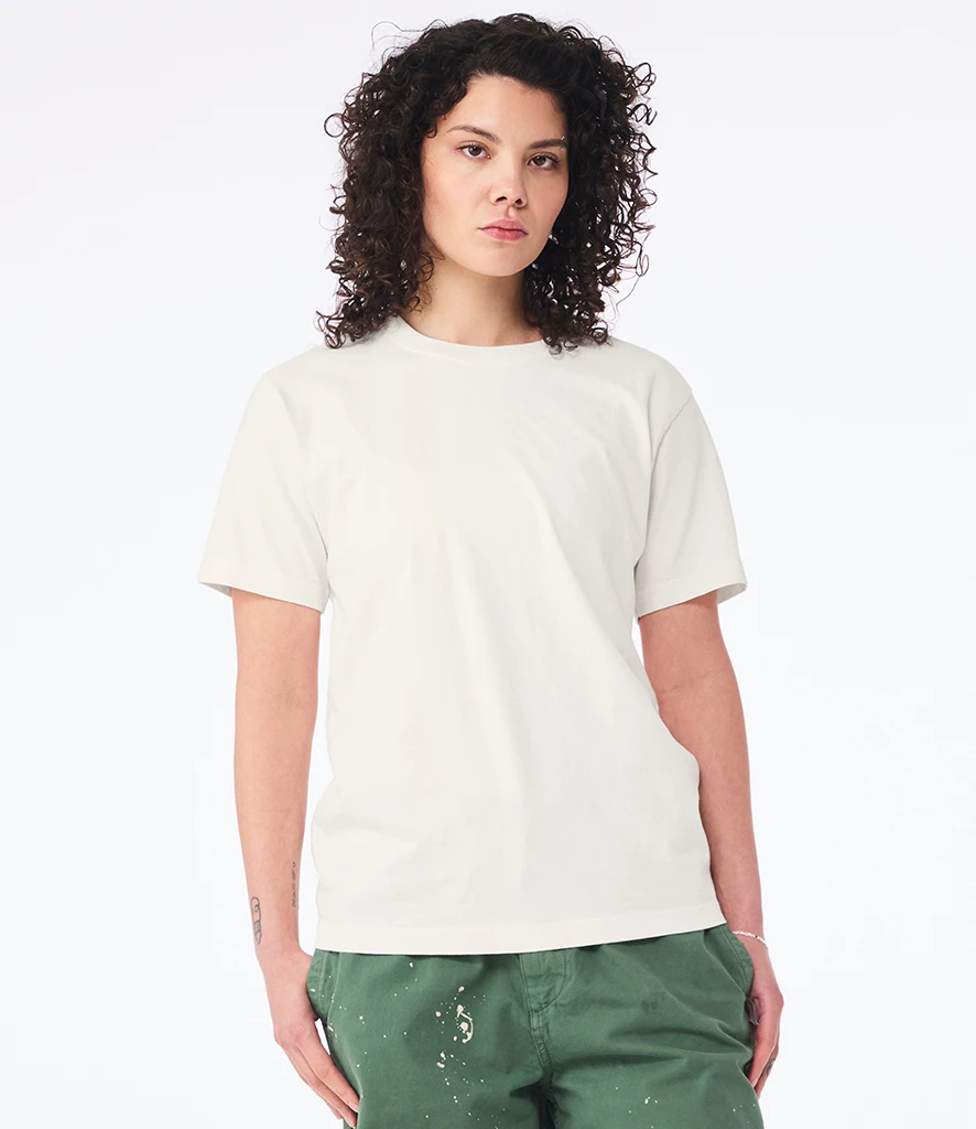
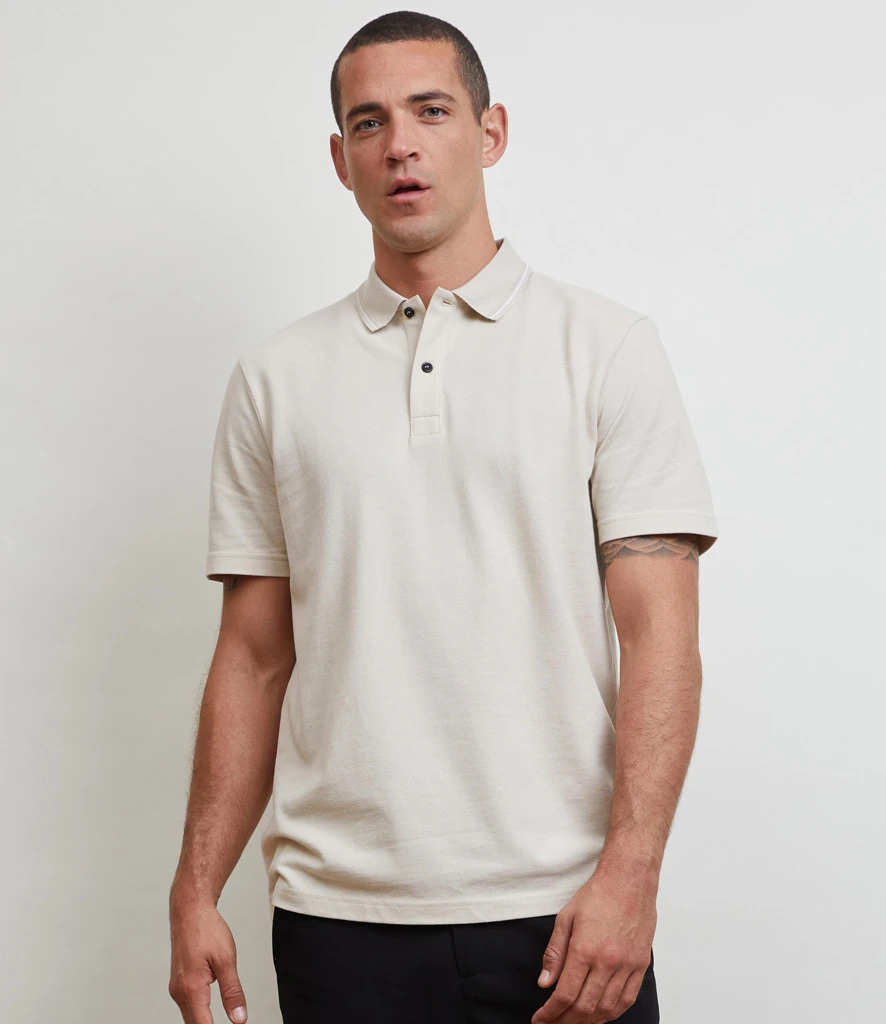
Cloud Dancer
WOW with Pantone's Colour of the Year
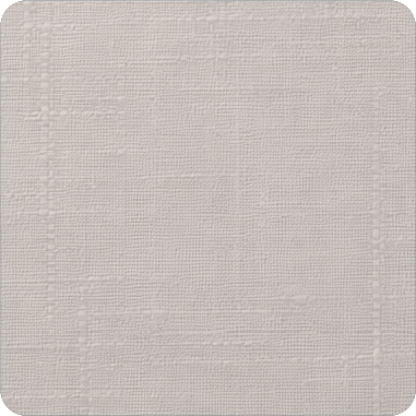
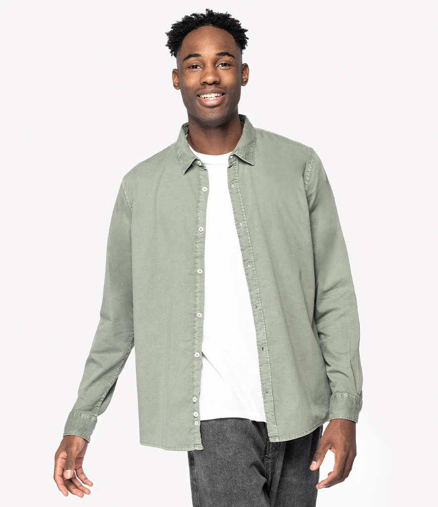
Cloud Dancer taps into the continued customer shift toward calm, easy neutrals. This shade offers a dependable foundation colour, bringing a fresh update to core palettes. Its gentle and versatile tone works well across elevated basics, wellness‑inspired apparel, and clean, branded collections, supporting ranges that lean into a more minimalist look.
Where it’s showing up:
Where it’s showing up:
- Corporate & Hospitality: Soft neutrals creating a fresh, welcoming palette
- Lifestyle Basics: Elevated everyday essentials
- Wellness & Eco Stories: Natural tones that support clean identities
- Premium Casualwear: Warm off‑whites for soft, modern silhouettes
How to use it:
- Perfect for minimal or tonal decoration
- Works beautifully on soft basics and premium loungewear
- Pairs naturally with earth tones and washed hues
Similar shades:
cream, natural, off‑white, ecru, bone, vanilla, pear
Looking for products that fit each colour group?
cream, natural, off‑white, ecru, bone, vanilla, pear
Looking for products that fit each colour group?
Download our 2026 Colour Product Guide.

WOW with Pantone's Colour of the Year
Cloud Dancer taps into the continued customer shift toward calm, easy neutrals. This shade offers a dependable foundation colour, bringing a fresh update to core palettes. Its gentle and versatile tone works well across elevated basics, wellness‑inspired apparel, and clean, branded collections, supporting ranges that lean into a more minimal look.
Where it’s showing up:
Where it’s showing up:
- Corporate & Hospitality: Soft neutrals creating a fresh, welcoming palette
- Lifestyle Basics: Elevated everyday essentials
- Wellness & Eco Stories: Natural tones that support clean identities
- Premium Casualwear: Warm off‑whites for soft, modern silhouettes
How to use it:
- Perfect for minimal or tonal decoration
- Works beautifully on soft basics and premium loungewear
- Pairs naturally with earth tones and washed hues
Similar shades:
cream, natural, off‑white, ecru, bone, vanilla, pear
Looking for products that fit each colour group?
cream, natural, off‑white, ecru, bone, vanilla, pear
Looking for products that fit each colour group?
Download our 2026 Colour Product Guide.
Seasonal supporting colours


Natural / Off-Whites you'll love


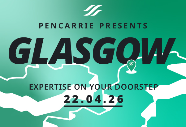
Built for you. Backed by industry leading brands!
Your NEW regional event of the year!
We’re taking the guesswork out of the garment industry and bringing you the latest insights and inspiration directly to your doorstep! Join us at Hampden Park on the 22nd April for the ultimate one-day experience, jam-packed with expert insights, hands-on demos and up-close access to industry leading and exclusive brands.
We can't wait to see you there. Looking for more information? Contact Gavin, your local expert.